Year
2019-Today
My role
Research
UX
UI
Digital retail
Why reserving a vehicle?
In 2019 we started working on a digital retail solution allowing customers to complete a vehicle purchase online. The idea is to create an ecosystem that enables customers to choose how to buy, from a completely online journey to moving through multiple touchpoints, online and offline.
A digital commerce for cars is different from any other e-comm for several reasons; one of the most important is that it's likely that the consumers would not be able to complete the purchase of a car immediately.
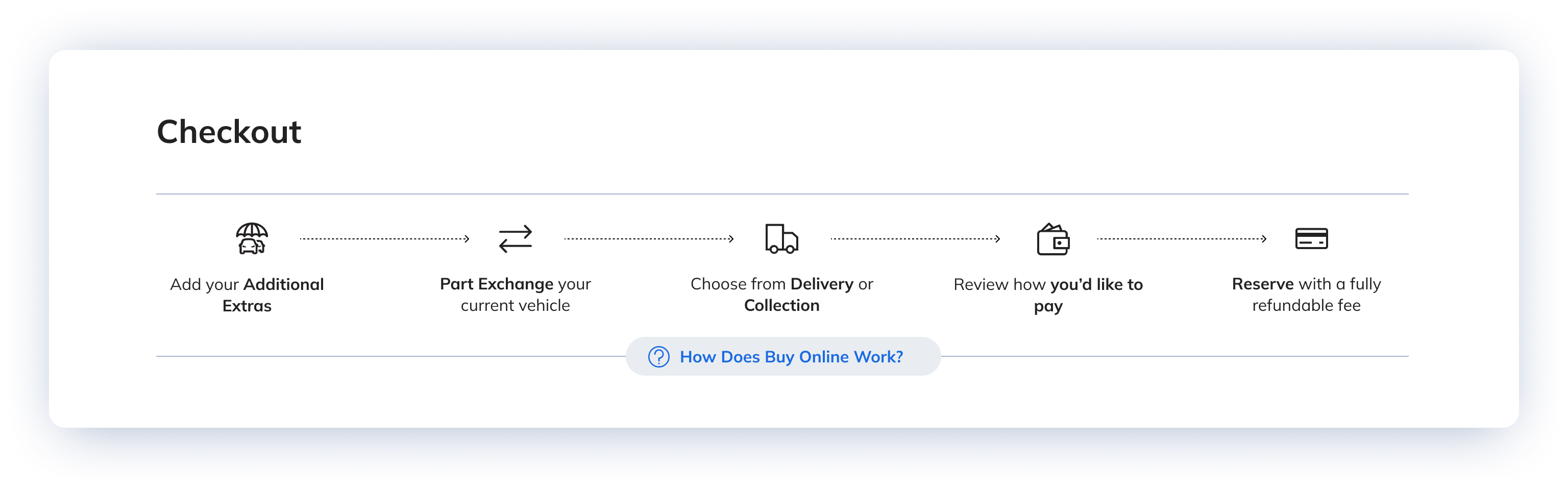
The possible checkout scenarios were mainly two:

Paying cash, by bank transfer, credit or debit card.
The consumer needed time to fill out all the papers required by legal regulations, such as money laundering.

Applying for finance.
In this case, the time was needed to complete the credit check process and the paperwork required by this type of application, plus most lenders require up to 48 hours to give a response.
It’s important to highlight that the cars sold online were ‘one of a kind since they were mainly:
• Used car.
• Car in stock immediately available.
Experience suggests that the consumer could have easily lost the desired car with the time required by the legal journey.
Most people do not realise that the car is “one of a kind”, and multiple customers are often attracted to the same car. We also need to consider that some customers are just exploring but not yet ready to commit, so how can we give better quality leads to retailers?
The sellers (retailers) had no intention of blocking the car to wait for the required time without any commitment, while customers needed time to complete the process, and some were faster than others.
It could happen that someone else could buy the same car on a different channel while one customer goes through the paperwork. Reservation solves this issue.
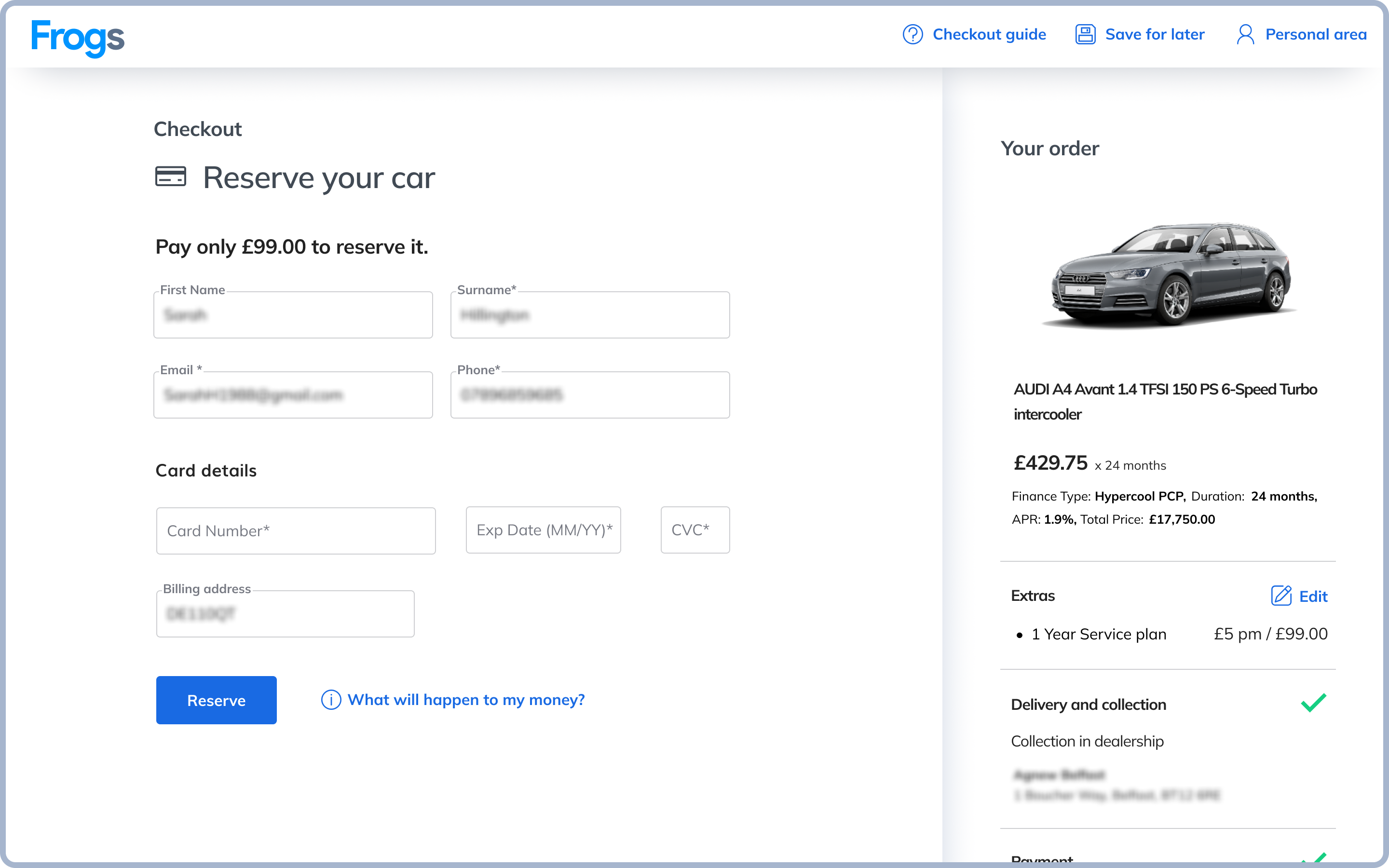
We already have a stand-alone solution that allows customers to reserve a car online before finalising the sale in the dealership.
So, we decided to use the same solution in the new e-comm and offer customers the possibility to “reserve” and “block” the car by paying a fully refundable amount.
This money would become part of the final payment once all steps had been completed.
While the concept of reservation worked incredibly well as stand-alone, when we went live with the e-comm, analytics showed that something needed to be fixed, as most people abandoned the journey once presented with the reservation step.
We had analytics that showed us what was happening but not why, so I invested time and budget in qualitative interviews.
User Research.
 Screening criteria:
users between the age of 25-65, who wanted to buy a new car. (Specific brands)
 Number of users:
 Methodology:
Semi-structured interviews
I discovered that users understood the concept of “Reservation”, but it wasn’t clear why they should reserve a vehicle since they were buying it.
Reserving clashed with users’ mental model of how an E-commerce should work.
The similarity was also amplified by the approach we decided to take.
Stakeholders wanted the most functional and quickest possible journey, with as few clicks as possible.
This could have been problematic for an unfamiliar journey (traditional car sales rely on retailer guidance that drives and explain each step to prospective customers).
Since we compromised on other important topics, I agreed to test this approach with the caveat of having the possibility to iterate on it.
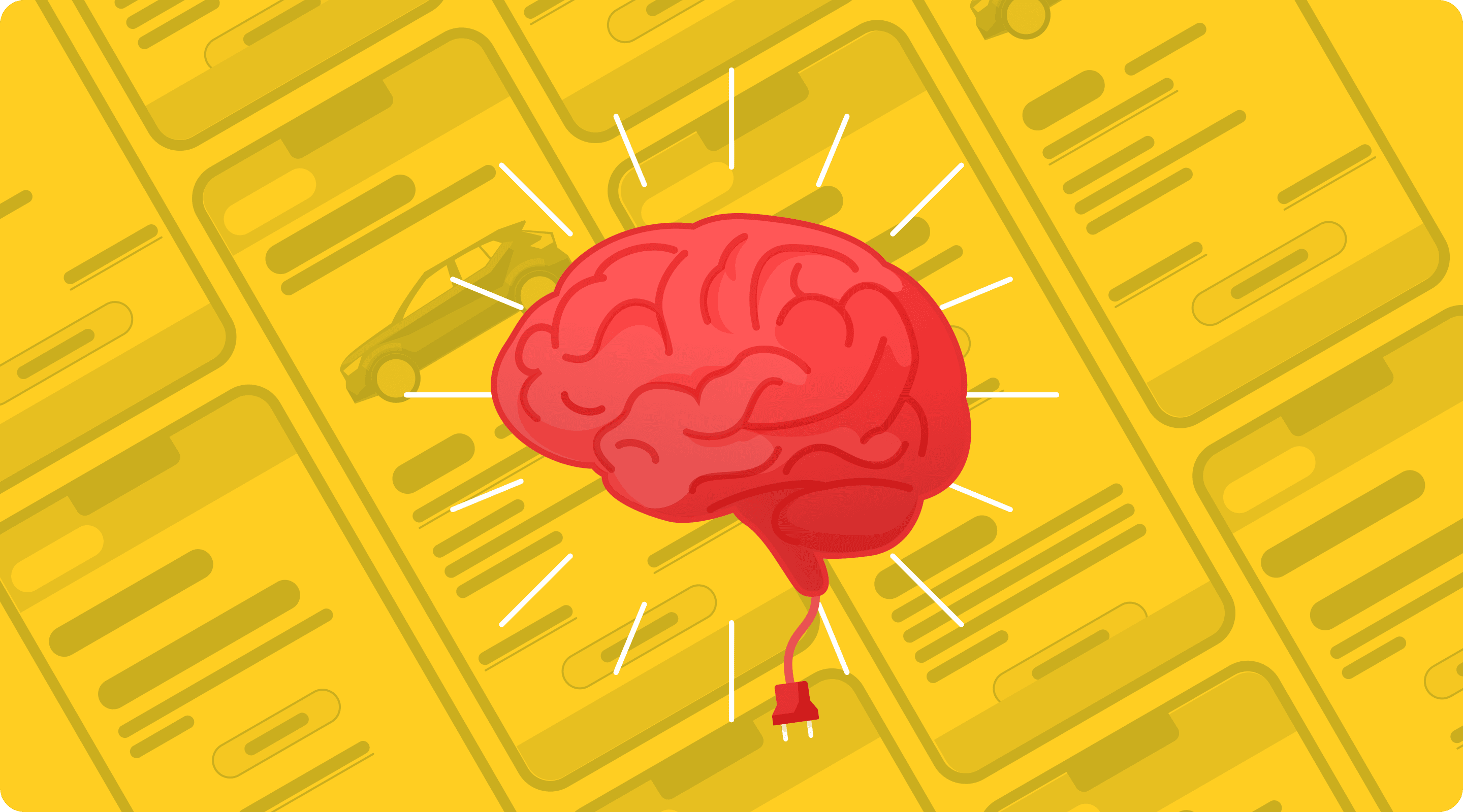
The research also proved that most people were reluctant to buy such an expensive item entirely online.
The transactional part was an emotionally dense experience, and they were not trusting it because there was not enough onboarding and reassurance about how the process would work.
Thanks to the qualitative outcomes, I provided guidance for a new solution to improve what we built without starting from scratch.
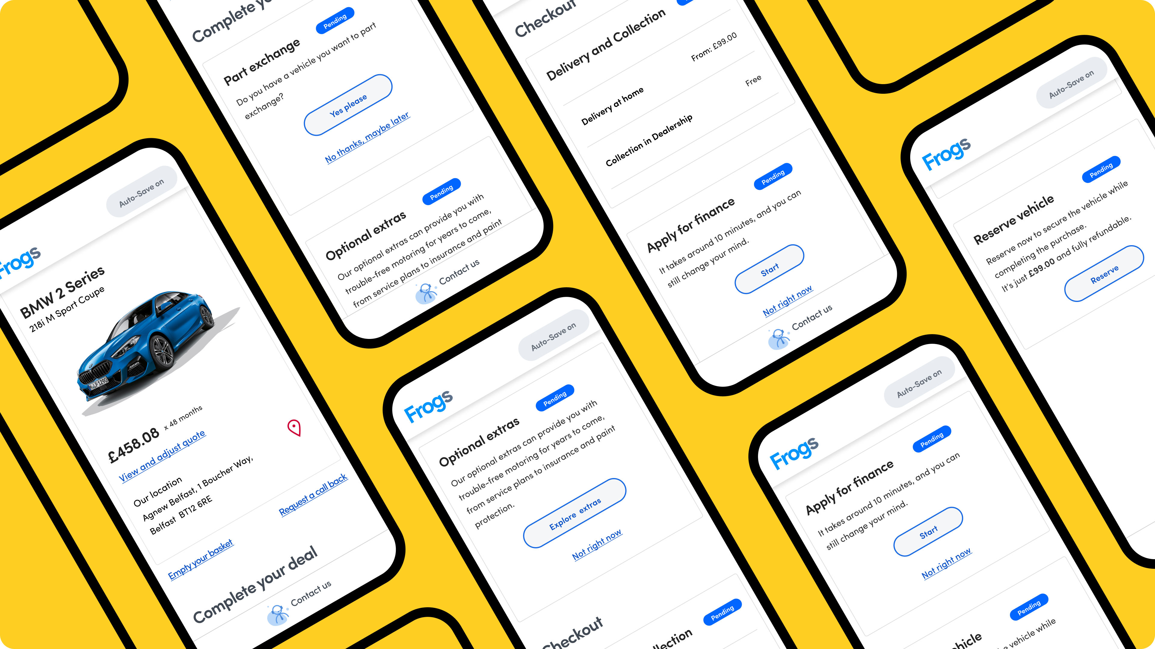
The Experiment.
First iteration:
To exploit the conventional user interaction with a well-known pattern such as a clickable stepper.
We designed a pattern resembling a stepper, with all the checkout touch points shown at the beginning of the journey. A slide-out with a more comprehensive guide to checkout becomes available by clicking on it. The user can close it, but if they desire to get information at some point, they already know where to look at.
The pattern is intended to explain in depth what the user should have done at each step (feed-forwarding).
We had to provide context, but people don’t read; people scan. So we spent quality time iterating to clearly craft content that would have allowed scanning and quickly identifying the reassuring bits.
The final solution was simple and relied on the action I hoped the user would have done on a standard stepper wizard: clicking on it.
pseudo-stepper
Second iteration:
Changing the order of the tasks, moving the reserve from the second position to the last; this allows users to realise that the purchase process takes longer and requires more steps than what is needed for general lower-priced goods.
If they choose a finance path, it would be clear that they’ll need to wait for a response, while if they decide on a cash path, they’ll need to wait for the final invoice to arrive.
This would give them context and make it more reasonable to “secure” the vehicle with a small advanced payment.
(This iteration also helped solve other issues, but this is a story for another time.)
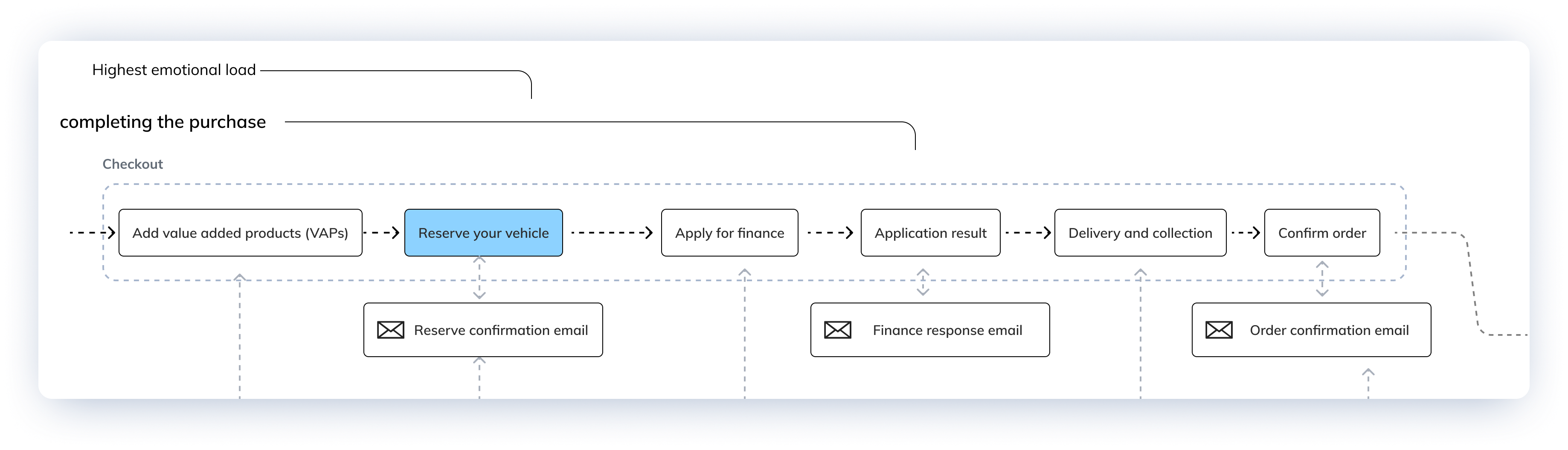
The flow before the changes
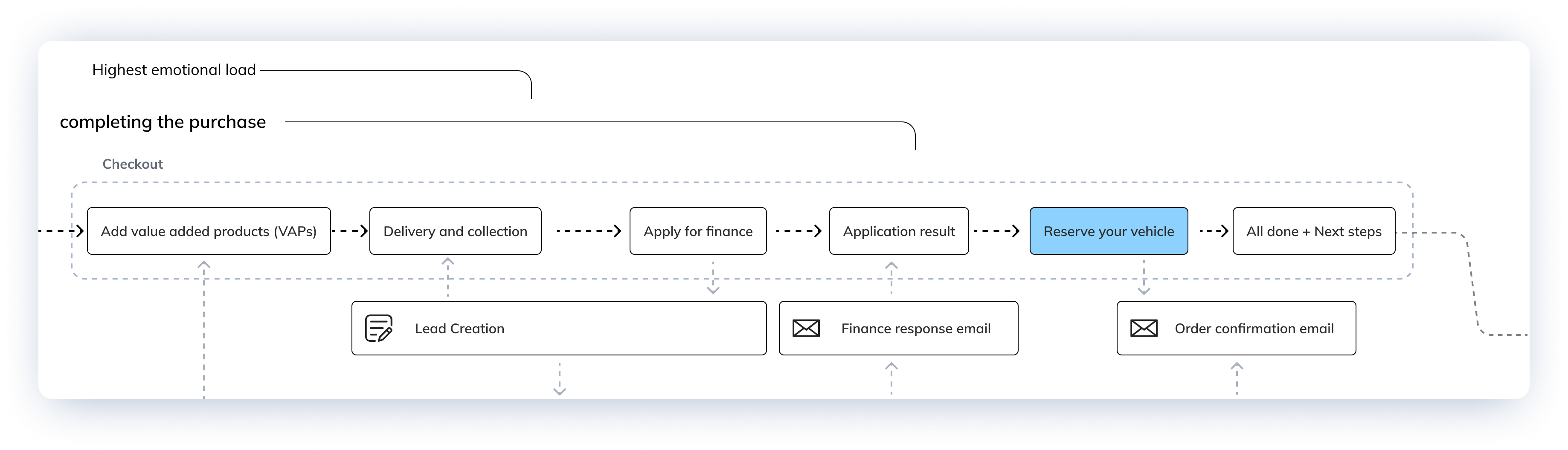
And after the changes
The outcomes
Since we introduced the onboarding, the number of completed orders has increased consistently, and the reserve step has become more accepted by customers, even if there is still work to do.
Next steps: Reserve will become dynamically available only if needed (e.g. it should be prompted if the user takes longer than X amount of time or it should be proposed after the submission of a proposal), and with specific content addressing the fear of loss.
Pretty pictures.
Some concepts, prototypes and sketches produced during the process.
An old prototype. this would have allowed users to choose which task to tackle first.
What we discovered was that people got confused by having too many choices (information overload is the most likely culprint).
Another old prototype. This is part of a concept that present the reserve journey only if it's needed.


Copyright © Alessandro Molinaro 2006-2023